Ubiquiti – UniFi Protect
I worked on the Protect team — physical security hardware and the platform that runs it. Deep integrations across UniFi's security devices, serving 1M+ users monthly, from single households to large enterprises.
role
Senior Product Designer
timeframe
2025 – 2026
contribution
Product strategy, User experience, Visual design, Web development, Design system
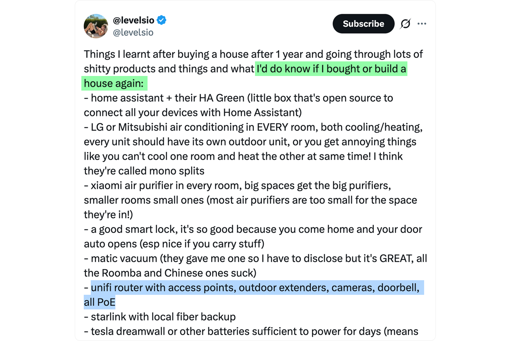
When Pieter Levels recommends this system as a must-have, you know it's tested to its limits.
Controls for Pan-Tilt-Zoom Cameras
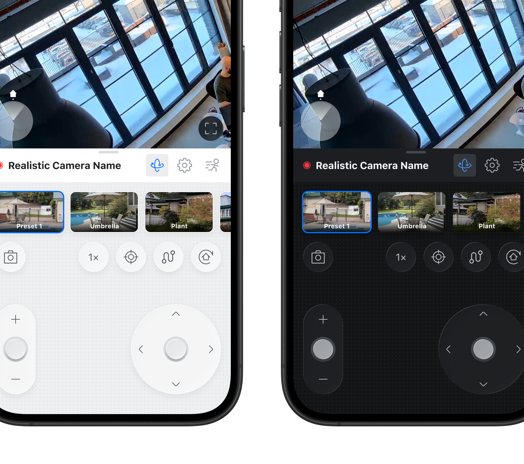
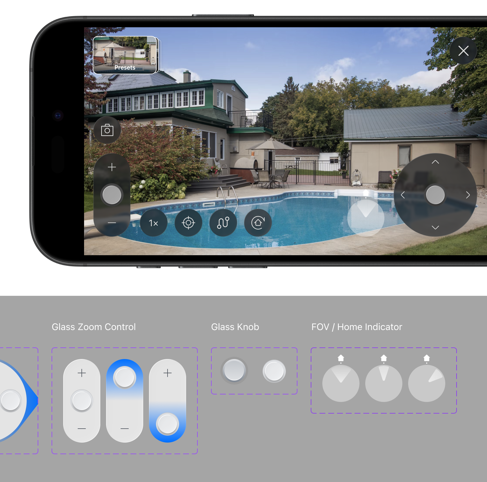
Controls for moving around your PTZ camera lens were cumbersome and only available in landscape mode. I created a simple and intuitive control segment for an uninterrupted experience. Never forced to landscape view, never lose your thought. Just eyes on the target.
NVR Mobile
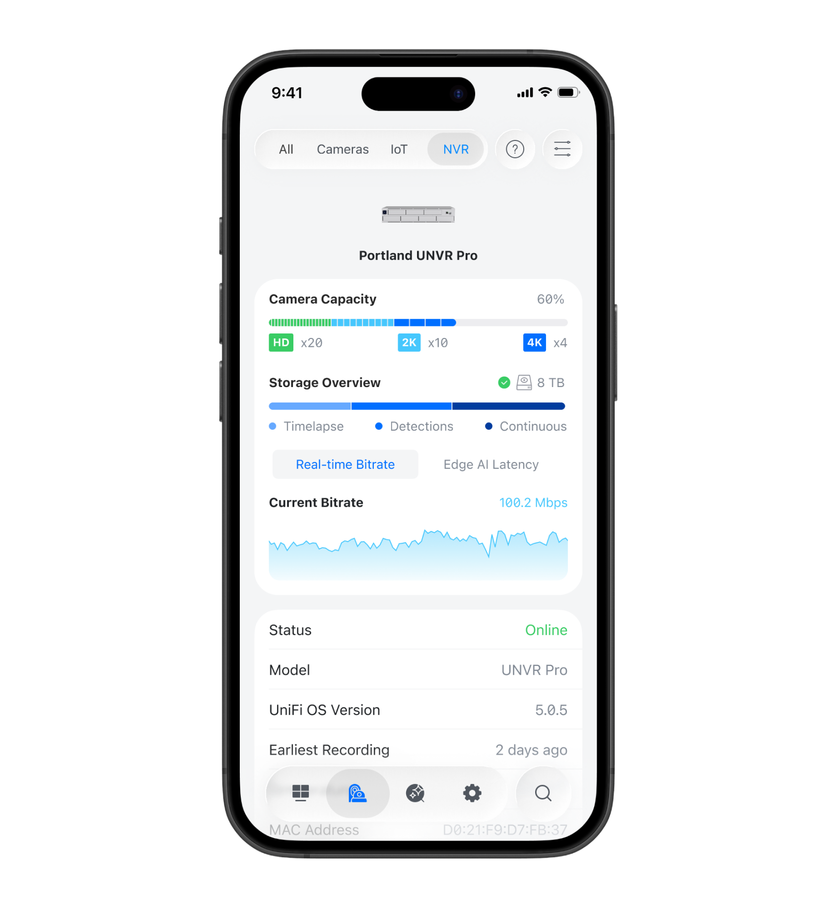
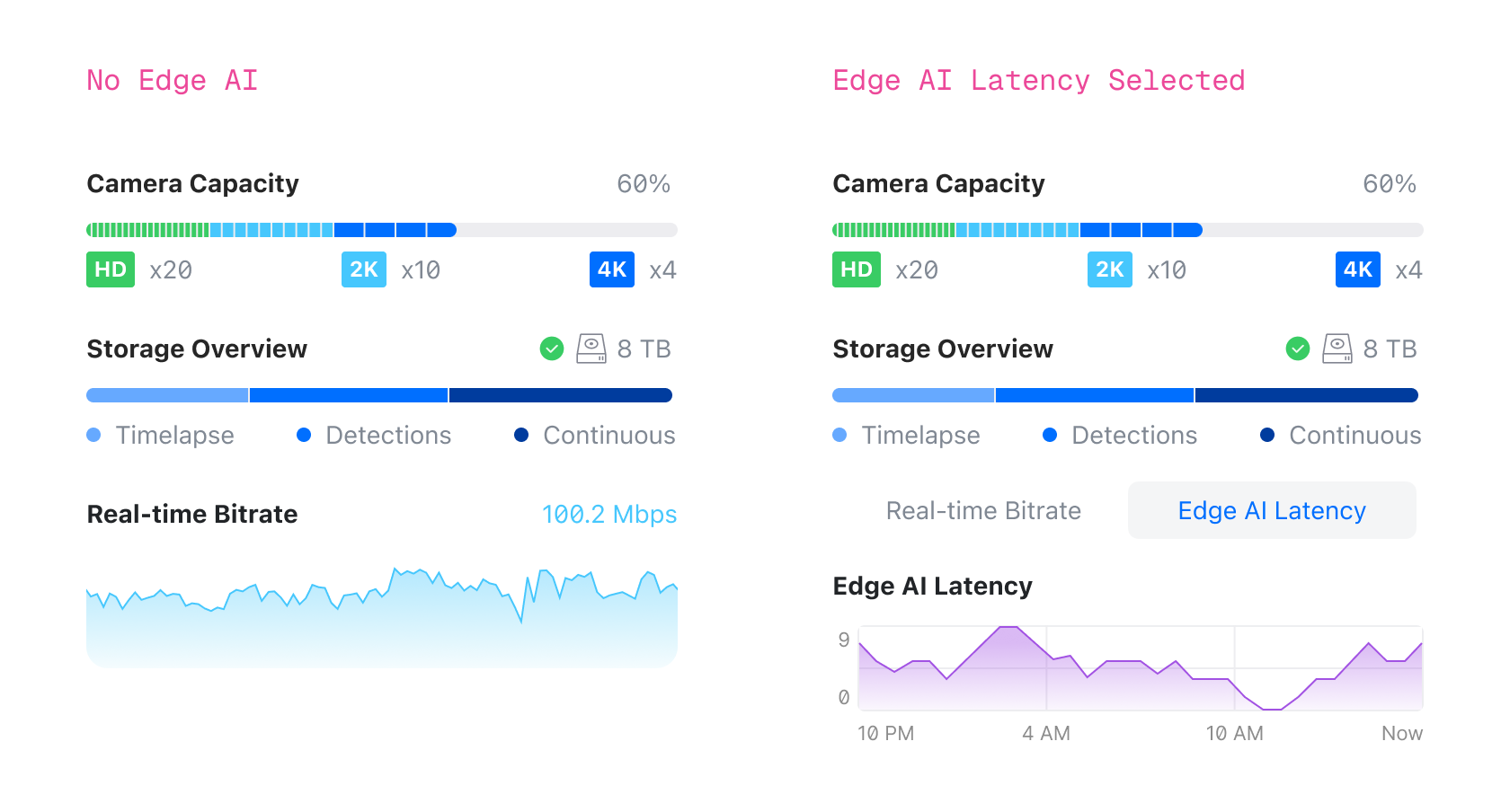
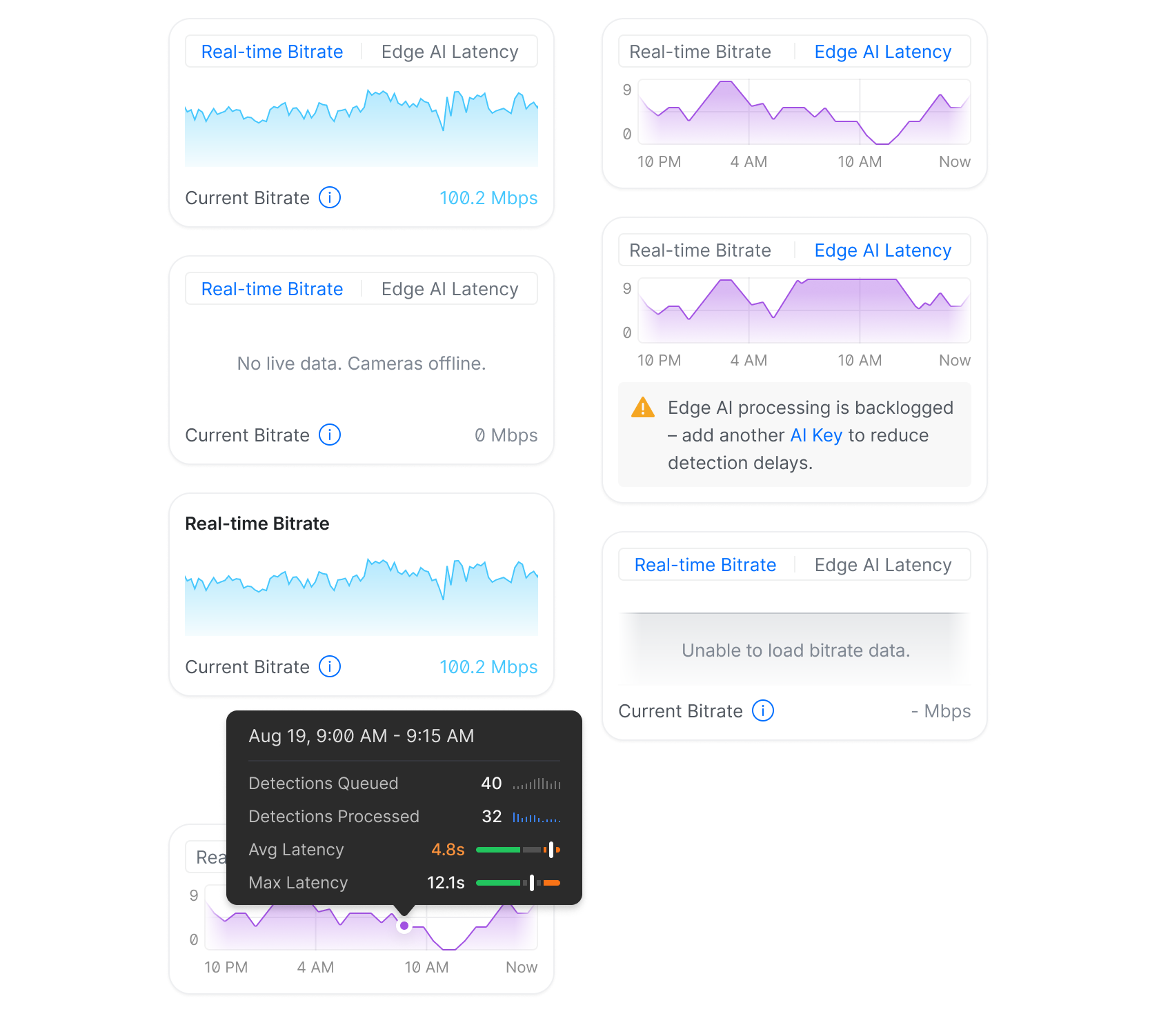
NVR (Network Video Recorder) is a complicated device that processes all of your video recordings locally, without them ever leaving your home. Think of it as a server. The mobile apps showed nothing about NVR capacity or health. I designed a way to read both at a glance.
Alarm Manager
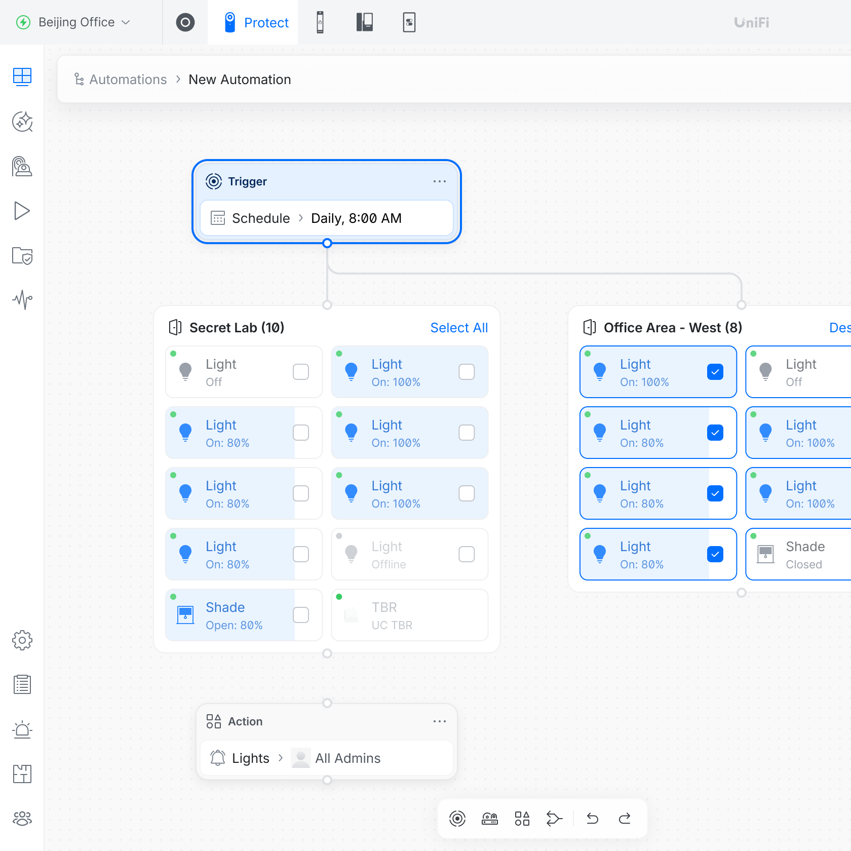
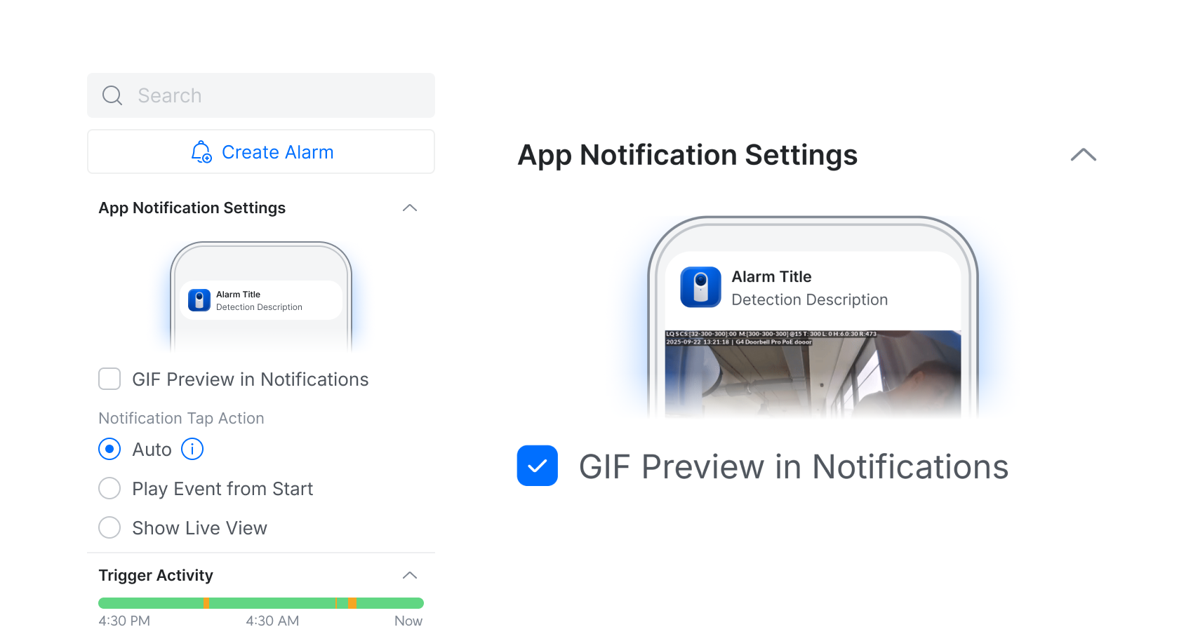
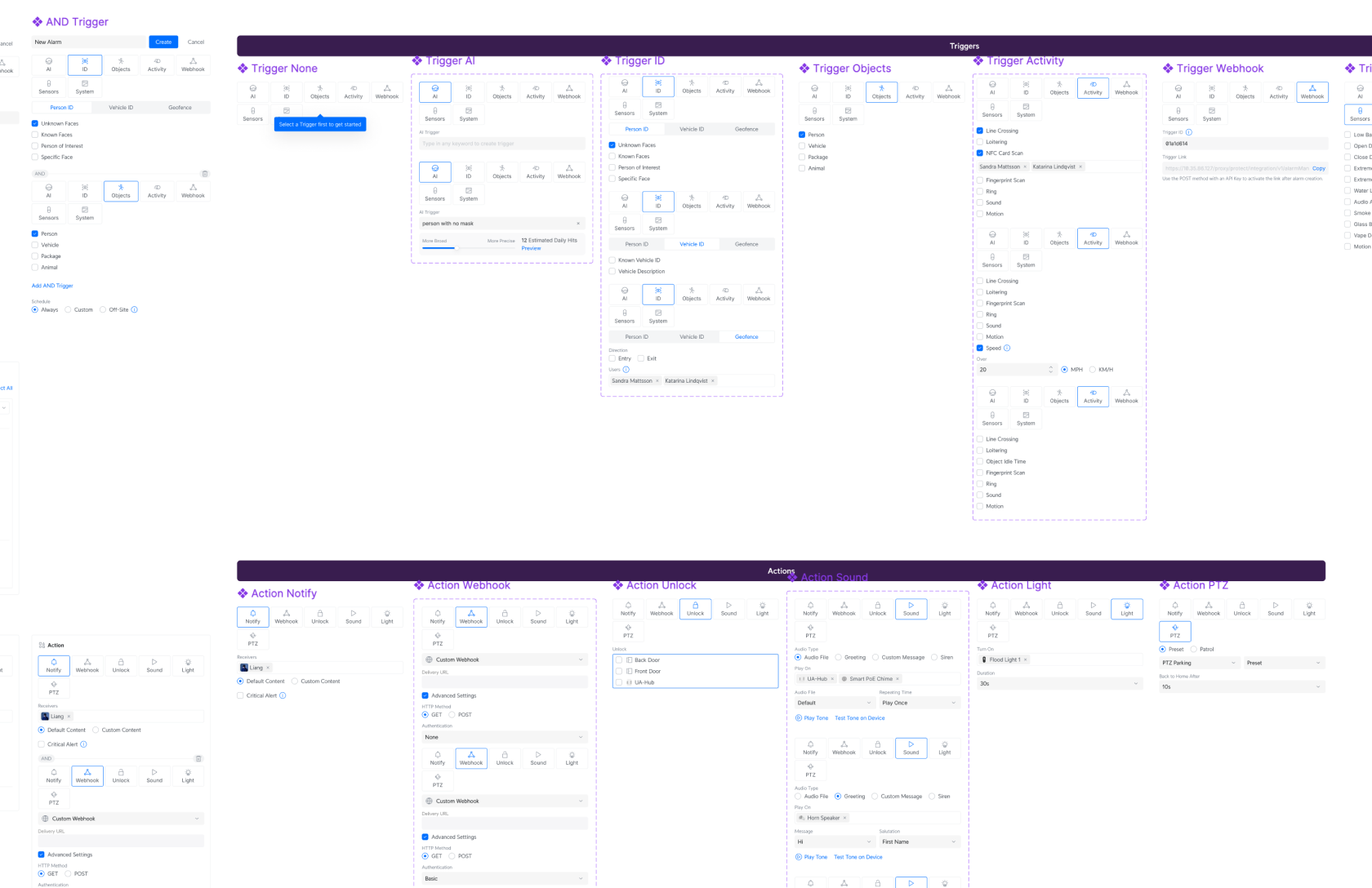
Creating alarms was a linear flow, and user feedback showed it breaking down as features piled up. On my own initiative I designed and prototyped Automations: a node-based engine for building complex, conditional automations. It's now the direction the alarm foundation is heading.
New Device Adoption On Mobile
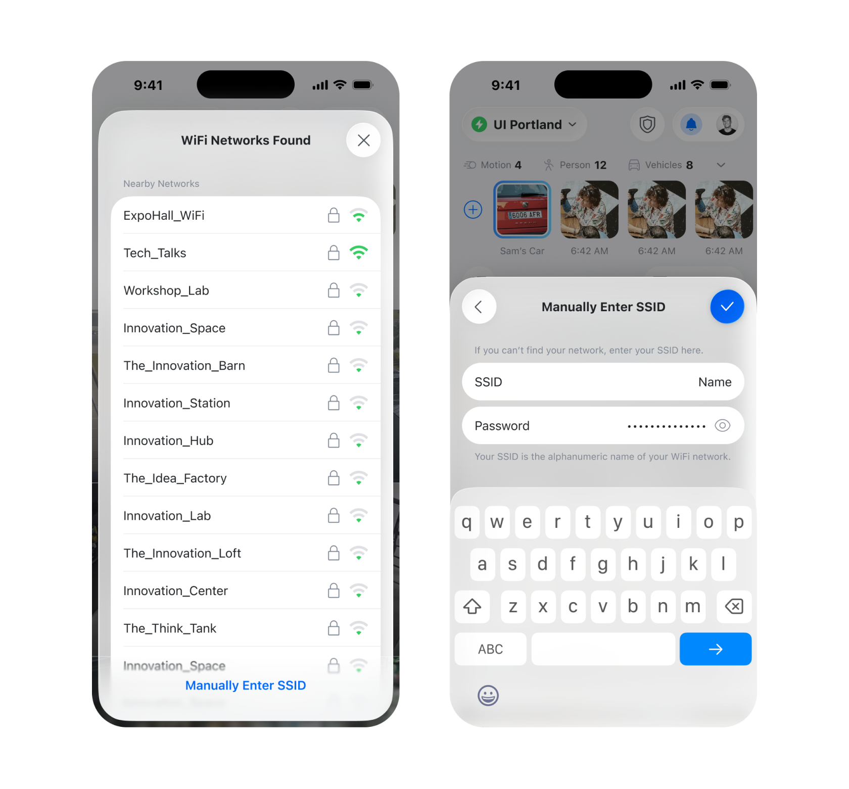
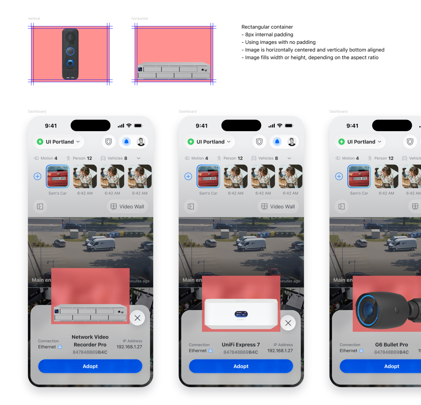
Protect is ten years old, and legacy design had settled into the adoption sheet — the first screen a user ever sees after plugging in a new device. It's the start of every product's life on the platform, and it looked its age. I rebuilt the look and the system behind it.
Dashboard Camera Grid Arrangement
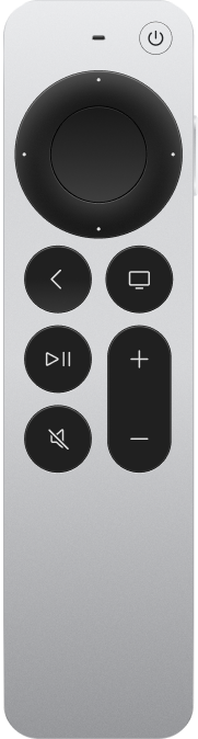
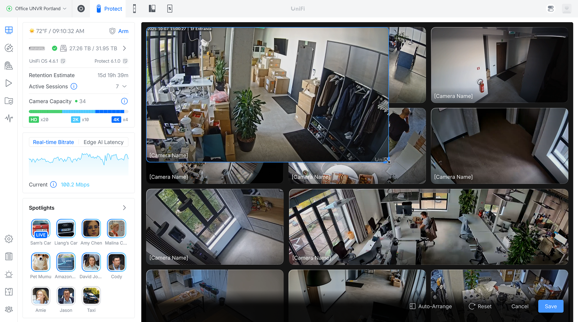
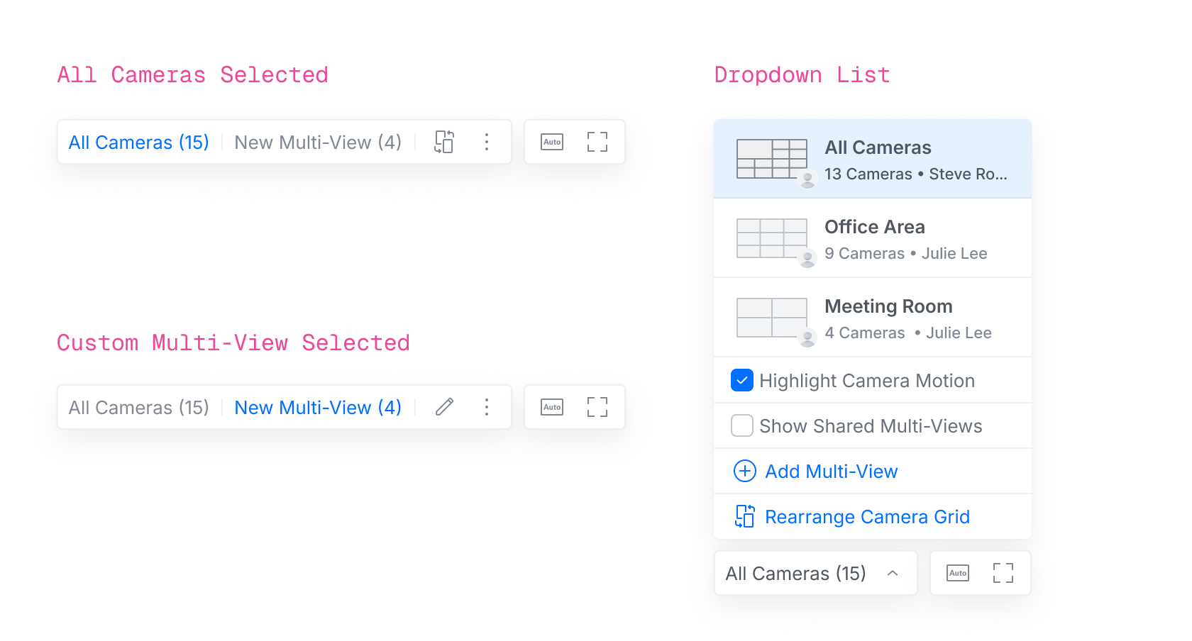
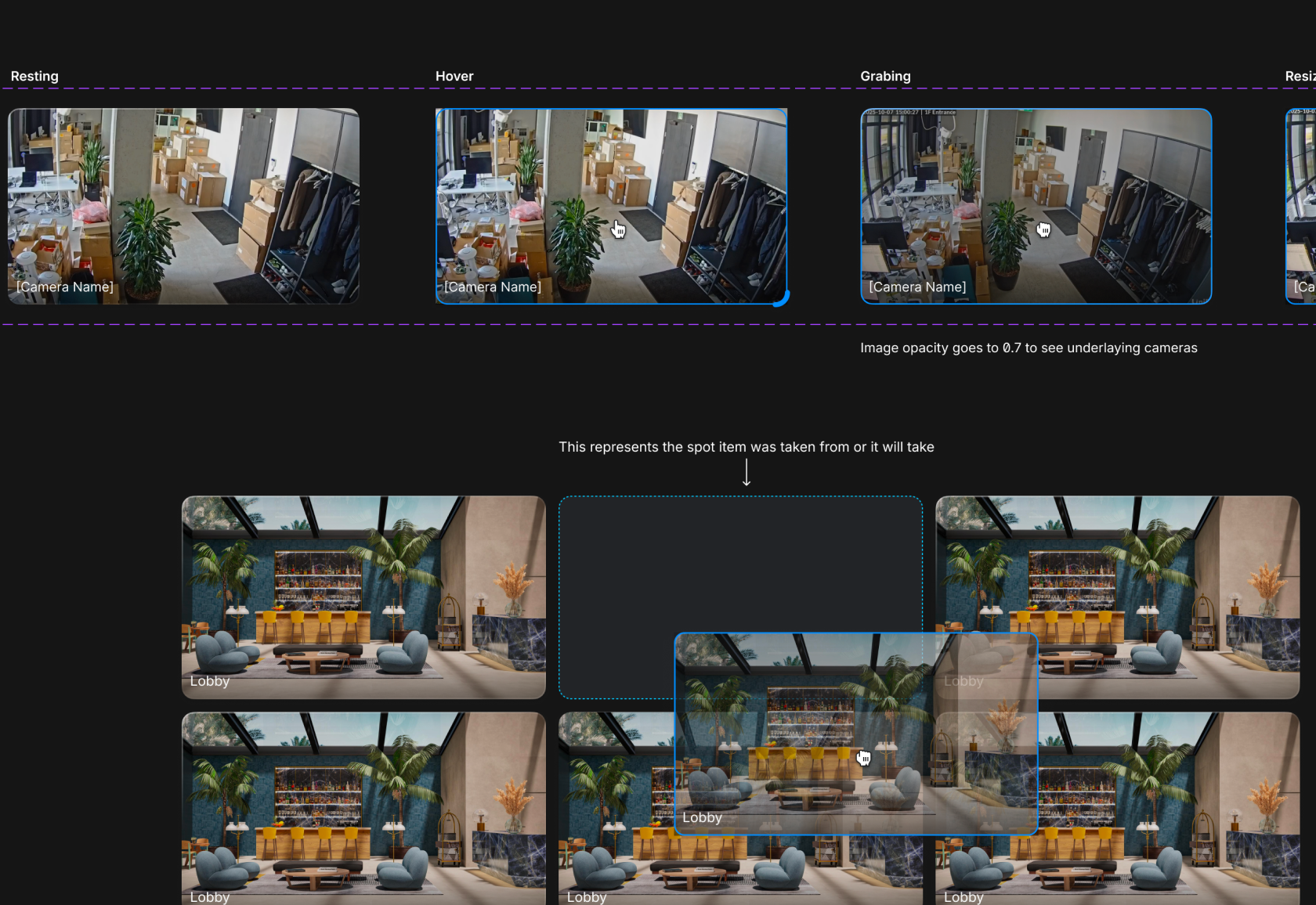
Camera grid is the bread and butter of the Protect dashboard. It's the most common use case for most users. As the technology develops, also user needs develop. They have wide angle 180° cameras, dual lens cameras, 360° sphere cameras. And the grid needs to account for that. So out goes the old static grid — I designed a flexible grid system where users can drag, stretch and arrange the camera grid in any way they would want. Create multiple different grids or even view their whole security system on Apple TV.
Integrations
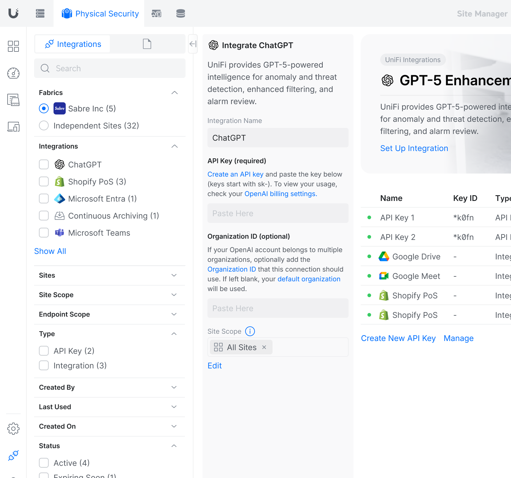
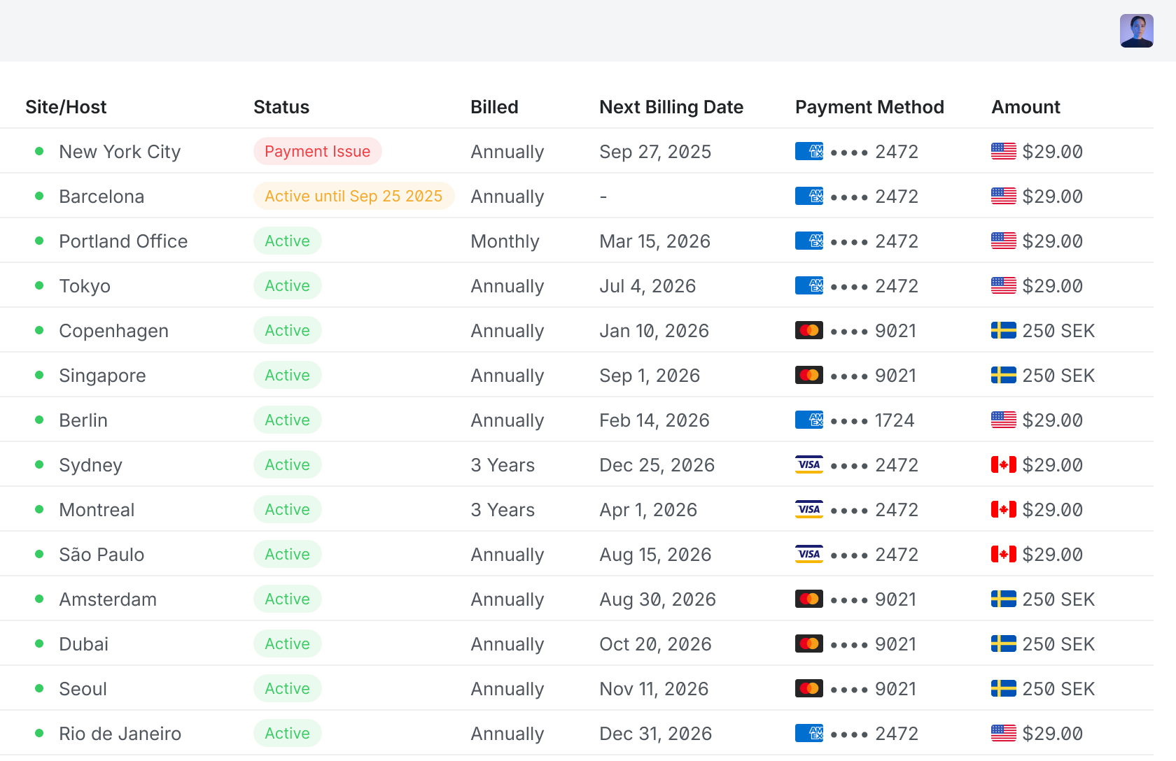
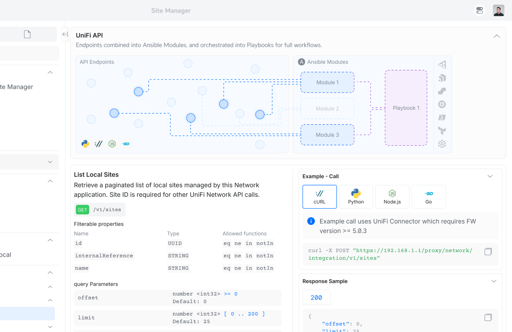
Another project I worked on from scratch. Integrations is a powerful extension of Protect. Imagine connecting your security system to a PoS terminal for store owners, for camera and sales event data cross-checking. Or integrating your sensors and cameras with a security company. This involves a lot of third-party coordination — aligning with integration partners' technical requirements and designing a system flexible enough to expose to users.
Hardware + Software
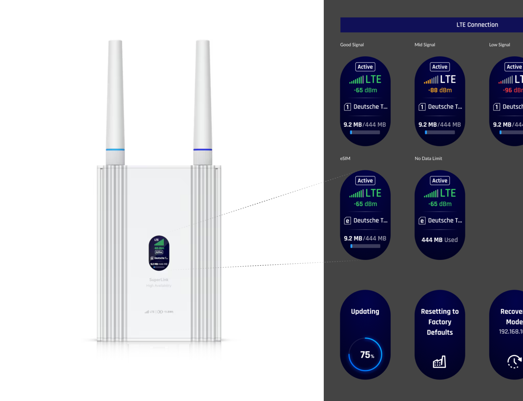
I'm a big fan of hardware design. And Ubiquiti takes great attention to detail in hardware. I was excited to be able to design GUI for devices that are not computers or phones. The constraints are real, and they help — fewer options means fewer ways to get it wrong.
Information Arrangement
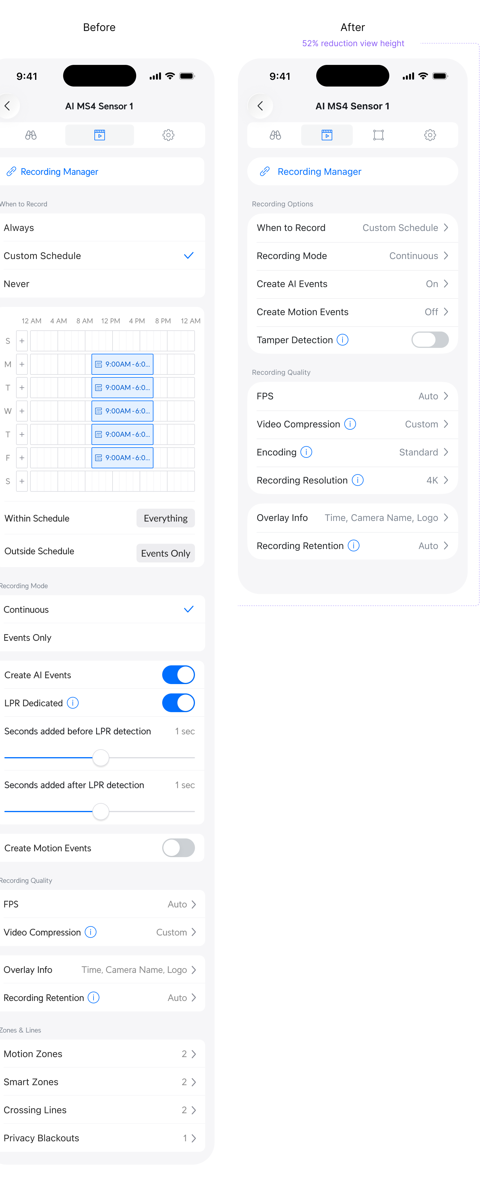
Knowing what to optimise, and how, is the daily work on an established product. Here is an example of a settings view that has collected various features and additions over time. I went on to see how we can compact it and reduce the mental load for users. Just by reorganizing the same information, we reduce the scrollable height by more than 50%. It's cleaner, easier to navigate and now also more aligned with the new iOS 26 design language.
Closing Thoughts
This is a fraction of what I shipped on Protect. The rest is best told in conversation — happy to walk you through the process.